![[Penguin Breeder Logo]](/img/logo-print.gif)
![[Penguin Breeder Logo]](/img/logo-print.gif)
There are about three or four points about the HTML/CSS layout of Penguin-Breeder.org that may be worth noting.
The page may claim it is valid XHTML 1.1, and the w3.org validator will happily approve that. However it's only XHTML 1.1 if your browser supports it. Such a browser will indicate that it accepts application/xml+xhtml. All other browsers (including the famous Internet Explorer™) are delivered a mangled version.
While the Internet Explorer still displays the mangled version as intended, other browser don't. That is because either they don't understand enough CSS or are plain broken. A possible solution to this problem would be to provide specialized versions for each and every broken software. Or just ignore them. I choose the later.
Now for the problems I had with CSS. The first one is about the black vertical line separating the menu from the main part of the page. Since I can't assume what fonts a browser uses to render the page, I can't place it at a fixed distance from the left edge.
The solution is quite simple. CSS allows you to define an offset for the background image. This offset can be defined in em (width of an "m" in the current font). The actual image is a 3x1 black bar, the CSS code is:
        html {
          background: white url('/img/bar.gif') 13em 0px repeat-y;
        }
The coordinate pair 13em 0px define the offset from the upper left corner. You can see the effect of this if you change your font size settings. The larger your font is, the further away from the edge the bar will be displayed.
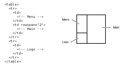
Here we have the basic layout of Penguin-Breeder.org. Nothing fancy, especially nothing difficult about this when done with tables.

It would have been so easy with tables. But I wanted it done without tables but using divs instead. Here is how I achieved this:
The "Main" and the "Menu" section can be directly mapped on a div. To place them next to each other, I have added an big margin to the "Main" div and made the "Menu" div a float:
        #Menu {
          float: left;
          width: 13em;
        }

        #Main {
          margin-left: 14em;
        }
Remember, the vertical bar was 13em from the left edge, so we let "Main" div start 14em from the left edge. We can now make the "Logo" a third float and use the clear property to make sure it never overlaps with the "Menu".
        #Logo {
          clear: both;
        }
We then get approximately this picture:

It is easy to reduce the width of the "Logo" div by setting an explicit width. However this won't let the "Main" div float right to the "Logo" div. You may think using a zero height or similar for the div might solve the problem but it will make the links in the "Main" div which are right to the "Logo" inaccessible.
The solution is to move the content of the "Logo" div in another div, let's call it "Logo2", and place this forth div absolutely. To avoid overlapping with the "Menu" we just add a margin of the size of the "Logo" to the bottom of the "Menu":
        #Menu {
          float: left;
          padding-bottom: 220px; /* 200px + a little space */
          width: 13em;
        }

        #Logo {
          clear: both;
          position: relative;
        }

        #Logo2 {
          position: absolute;
          top: -200px; /* height of the image */
          width: 13em;
        }
The result is (more or less) the same as we had achieved using tables:

And what did we learn from this? CSS sucks. Let's hope version three will fix this.
If you are one of those that don't want to install or even boot Microsoft Windows in order to verify their HTML pages with the Microsoft Internet Explorer, you can use the latest wine CVS snapshot to install the Internet Explorer under Linux/x86. Remember you need a valid Microsoft Windows License to legally run the Internet Explorer (the so called "Microsoft Tax" on new hardware...) Several sites describe how to install the Internet Explorer: